Red Bull TV
While working for the Berlin-based agency Edenspiekermann, I got the chance to work on Red Bull's most ambitious digital project to date. The brief was simple: reinventing television as we know it.
What is Red Bull TV?
We all know the energy drink, but Red Bull also creates and produces a lot of video content. From films and shows, to live events and video clips. Red Bull TV is the home for all that video content. Free and available worldwide on 23 platforms.
Scan to watch this video
The project
In 2014 Edenspiekermann was tasked to rethink the experience of Red Bull TV. We got carte blanche. Anything was possible.
But there was one requirement: create a consistent experience across all surfaces that Red Bull TV would be shown on.
I was the design lead on this project, working with over 15 people over the course of two years. I also moved from Berlin to Los Angeles in 2015 to be closer to the headquarters of Red Bull Media House.
Designing for all sizes
Red Bull TV was going to be displayed on screens as small as an Apple Watch, and as big as a movie theater.
To simplify design, we grouped platforms in 4 different categories: 10ft (named after the average TV watching distance), mobile, wearable and web. Our team at Edenspiekermann was responsible for the design of the 10ft, mobile and wearable platforms. Ueno tackled the web platform.
10ft platforms
For platforms that display on a TV like the Apple TV, Xbox, Roku or Kindle Fire TV, we wanted to do something special. Most video streaming apps force you to choose content before watching. Red Bull TV drops you straight into content.
No decision paralysis.
Instant content.

This is very similar to how the good old TV works. And we took the linear TV model further.
Red Bull TV doesn't just pick a random video and plays it. Instead, a 24/7 broadcasting channel was created, highlighting the best of the World of Red Bull. It's the same stream at the same time all around the world.
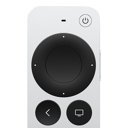
The reason we chose to focus on the viewing experience is the lack of precise input methods on 10ft platforms. The 6 inputs you can rely on are the up, down, left, right, select and back buttons. The lack of controls makes browsing and scrolling through large amounts of content tedious.
Our intention with the broadcast stream was that you don't even need to use your remote for anything other than opening the app.
Mobile platforms
As mobile devices provide more flexible ways of interacting thanks to their touchscreens, the app was designed to highlight more of the existing catalogue.
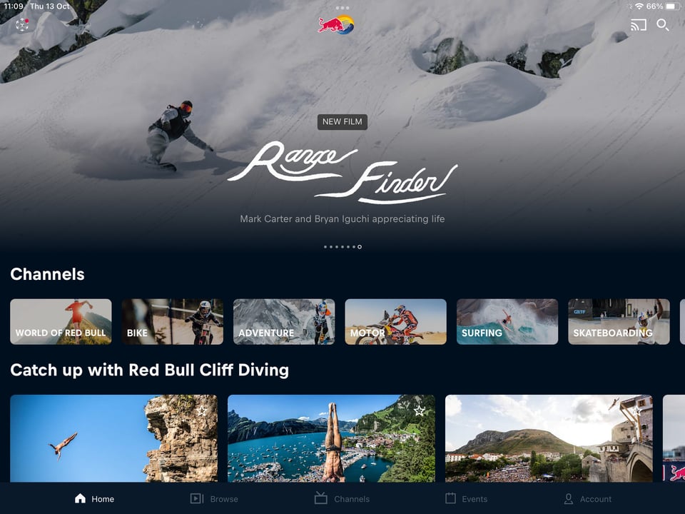
New films, recent event replays, and the various categories of content are accessible straight from the home screen.
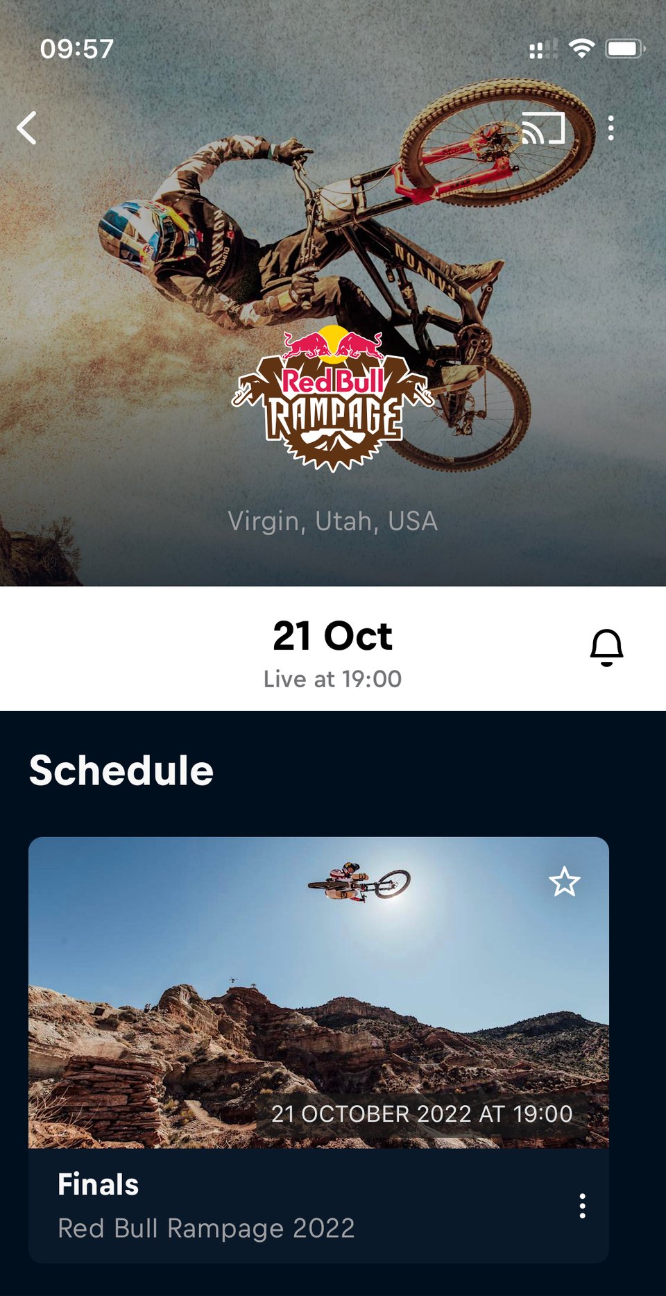
The live streaming of events is an important source of traffic for Red Bull TV. Highlighting upcoming events and reminding users when the stream goes live is therefore very important and perfectly suited to mobile apps.
A lot of time was spent on getting live content right. Especially when it comes to the edge cases.
Many sporting events depend on having the right weather conditions, like surfing. So events can have unknown dates, be delayed, or outright canceled. And all of these cases had to clearly be communicated to viewers.
Films and shows were easier to design for, as there was a lot more inspiration from existing material. But that didn't mean getting it right was straightforward. Simple questions like the ordering of seasons were not so simple to answer.
Wearable platforms

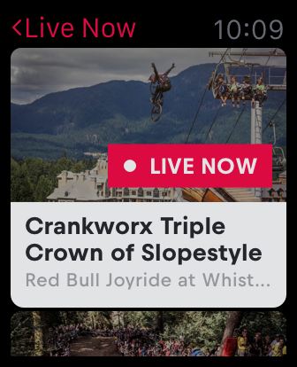
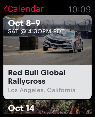
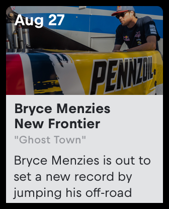
The Apple Watch launched in 2015, right in the middle of the Red Bull TV project. As an exploration, I downloaded the Apple Watch SDK and built a prototype watch app, focused specifically on reminders.
The sole functionality of the watch app is to see what's currently showing on Red Bull TV, and to show a calendar with the upcoming events. Watching content was intentionally left out of the watch app.
The prototype convinced the Red Bull team and the concept got shipped pretty much as is.
User testing and prototyping
We knew designing for 10ft platforms was tricky. So we spent a lot of time doing user testing and validating our designs in person before committing and shipping.
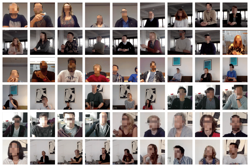
There was just one problem: how do we prototype a TV app?
And a smartphone app?
And a tablet app?
Luckily, in 2014, a new prototyping tool hit the market: Framer.js. It was a library that simplified the creation of HTML prototypes.
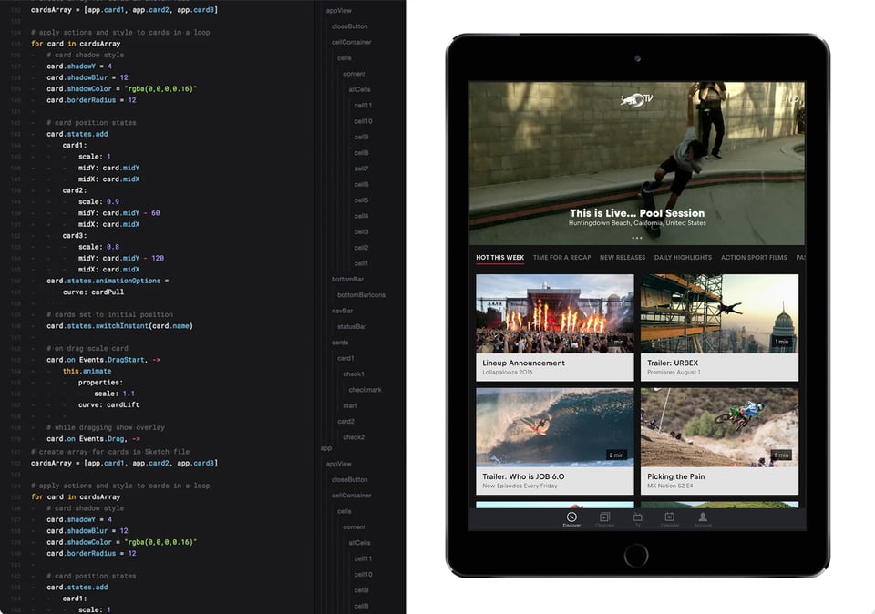
Our prototypes being HTML and JS allowed us to use the Red Bull TV APIs and populate our prototypes with real data and videos, making them much more realistic. This realism made testers more critical, as they thought they were using a product, not a prototype.
In turn, we gained a lot of detailed insights, and made the product better.
Ensuring consistency
From mobile apps to gaming consoles, the experience across devices needed to be coherent.
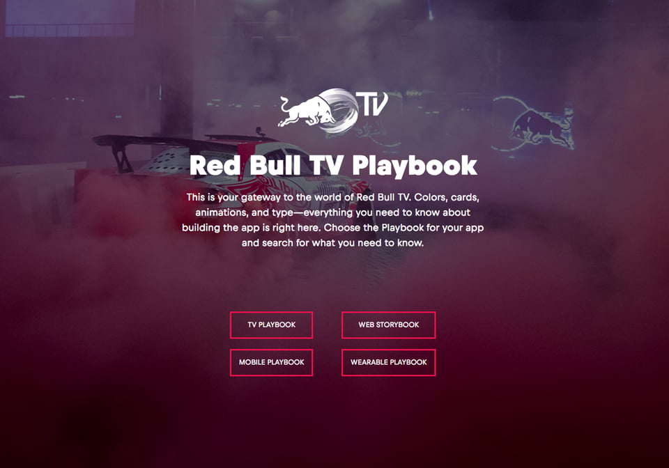
To ensure consistency, we created a source of truth: the Red Bull TV Playbook. This exhaustive documentation was shared with over 10 external partners and countless internal stakeholders.
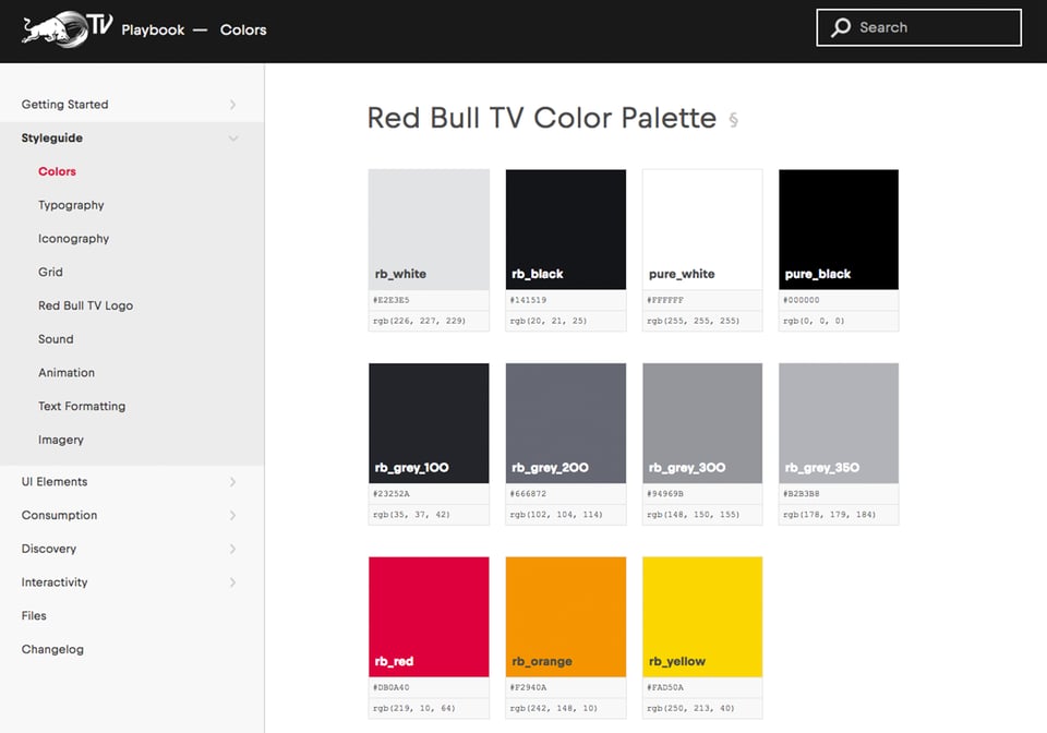
Everything the development partners needed to know was documented. Brand colors, fonts, user flows, interaction patterns, animations, sounds and more.
We created a complete design system that could easily be referenced. The Playbook was an invaluable asset to the project, without which every step would have been more difficult.
Launch and reception
Red Bull TV launched on April 20, 2016. It currently has over 10 million downloads on the Google Play Store, with a 4.8 ⭐️ rating.
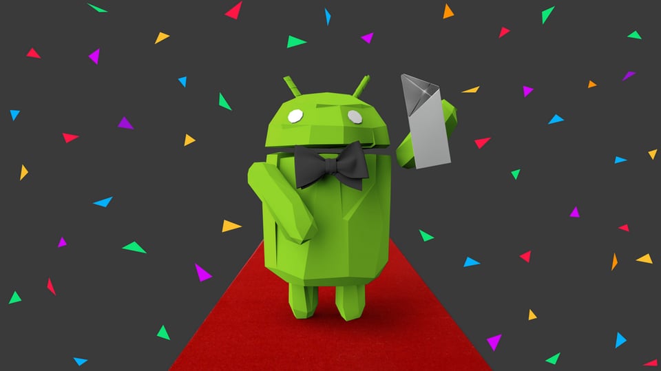
The 10ft experience was highly acclaimed, and the Android TV app was awarded the 2017 Google Play Award for best TV experience, beating Netflix.

